Insurance Self-checkout portal
Insurance Self-checkout portal
Colossal Insuarnce


Project Overview
Project Overview
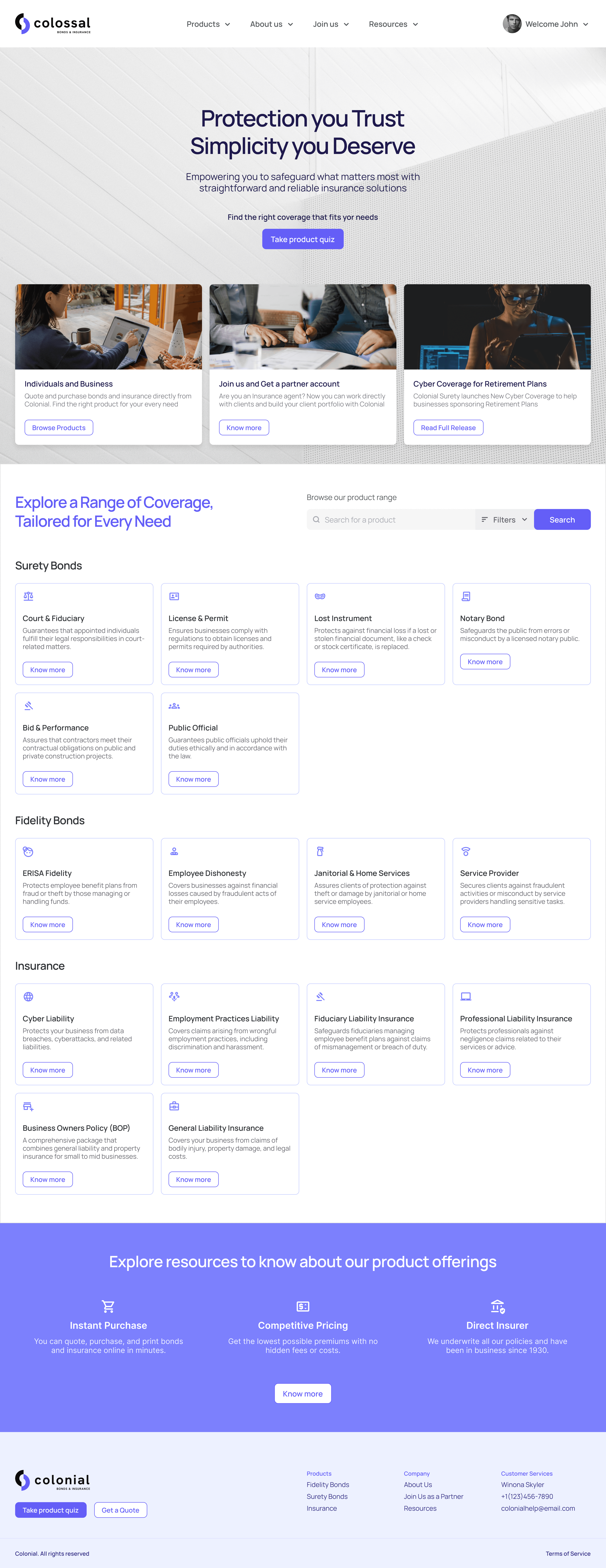
Colossal Insurance is a leading national direct seller and writer of surety bonds, fidelity bonds, and insurance products for various professionals and industries. They want to streamline the purchase flow for their portfolio's wide range of products to help customers with minimum insurance knowledge discover and purchase the right product to cover their assets.
Customers interact with the website to discover available products and proceed to purchase. To assist the customers with their purchases, an insurance agent can intervene and complete the purchase on the customer's behalf. I created the end-to-end experience of the web apps for Customers and Agents.
I carried out user research and developed user flows, wireframes, and prototypes for the new customer-facing portal and check-out flow. Confidential and sensitive information is modified in this case study.
My Role
My Role
My Role
User Research, Prototyping, Form Design
User Research, UX/UI Design
User Research, Prototyping, Form Design
Duration
Duration
Duration
6 months (Nov 2020 - Apr 2021)
6 months (Nov 2020 - Apr 2021)
6 months (Nov 2020 - Apr 2021)
Deliverables
Deliverables
Deliverables
Intuitive Insurance purchase experience for Web, Agent Dashboard, and Product discovery page.
Intuitive Insurance purchase experience for Web, Agent Dashboard, and Product discovery page.
Intuitive Insurance purchase experience for Web, Agent Dashboard, and Product discovery page.
Outcomes
Outcomes
Outcomes
16% improved product discoverability without agent help. Lower customer drop offs and form completion time.
16% improved product discoverability without agent help. Lower customer drop offs and form completion time.
16% improved product discoverability without agent help. Lower customer drop offs and form completion time.
Initial understanding
Initial understanding
Challenge 1
Challenge 1
Challenge 1
Reduce customer help tickets and user drop-offs due to long forms and complex finance vocabulary.
Reduce customer help tickets and user drop-offs due to long forms and complex finance vocabulary.
Goal 1
Goal 1
Goal 1
Provide secure, and cost-efficient options with coverage customization for insurance buyers.
Provide secure, and cost-efficient options with coverage customization for insurance buyers.
Challenge 2
Challenge 2
Challenge 2
Improve product discovery for surety bonds, fidelity bonds and insurance. Help customers find the right coverage for their needs.
Improve product discovery for surety bonds, fidelity bonds and insurance. Help customers find the right coverage for their needs.
Goal 2
Goal 2
Goal 2
Create a seamless experience for their customers and insurance agents to enable a smooth purchase and renewal process of the insurance products.
Create a seamless experience for their customers and insurance agents to enable a smooth purchase and renewal process of the insurance products.
Design Statement
Design Statement
“Create a self-checkout experience prioritizing product discovery, ease of navigation, clear guidance, and accessible support, for people looking to buy insurance”
“Create a self-checkout experience prioritizing product discovery, ease of navigation, clear guidance, and accessible support, for people looking to buy insurance”
User interviews
User interviews
Discovery
Discovery
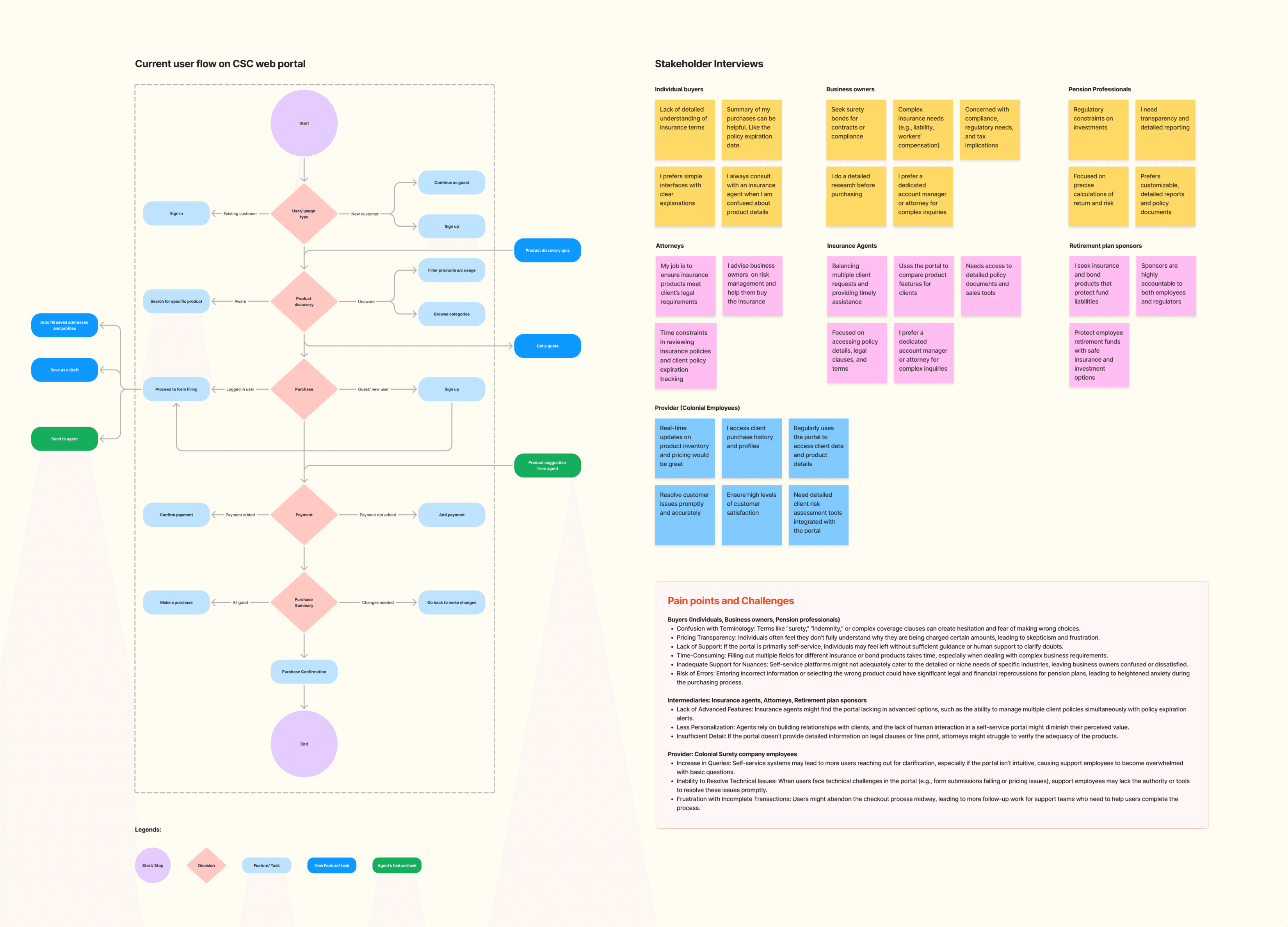
I interviewed different stakeholders to get insights into their expectations of the product and shortcomings in the existing service. The stakeholders are classified into three major categories:
Buyers: Individuals, Business owners, Pension professionals
Providers: Colonial Surety company employees
Intermediaries: Insurance agents, Attorneys, Retirement plan sponsors


Opportunities
Opportunities
Buyers want some assistance in choosing a product to purchase
Buyers sought agents in browsing and finalizing products to purchase
Buyers want some clarification on what to fill in the insurance forms and validation whether their input is correct.
Providers intervened in the purchase process to help buyers fill out forms or approve a purchase on their behalf.
Buyers want some assistance in choosing a product to purchase
Buyers sought agents in browsing and finalizing products to purchase
Buyers want clarification on what to fill in the insurance forms and whether their input is correct.
Providers intervened in the purchase process to help buyers fill out forms or approve a purchase on their behalf.

How might we
How might we
Help new users discover the right insurance product for their need.
Guide users to follow the purchase path to complete their purchases smoothly
Provide flexibility in their purchase (bookmarks, save as drafts)
Personalize the insurance purchase experience (product recommendations, smart alerts)
Automation (EMI payments, one-click purchase)
Easy help (agent communication, sharing)
Help new users discover the right insurance product for their needs.
Guide users to follow the purchase path to complete their purchases smoothly
Provide flexibility in their purchase (bookmarks, save as drafts)
Personalize the insurance purchase experience (product recommendations, smart alerts)
Automation (EMI payments, one-click purchase)
Easy help (agent communication, sharing)
Design goals
Design goals
Create an easy self-check experience for every customer when purchasing insurance products.
Design a guided purchase flow to help new customers and be flexible enough to support quick check-outs for experienced customers.
Address customer pain points like complexity and confusion through transparent and convenient user flows
Design Principles
Design Principles
Design Principles
I created user flows and lo-fi wireframes following these four principles to guide the process.
I created user flows and lo-fi wireframes following these four principles to guide the process.
Guidance
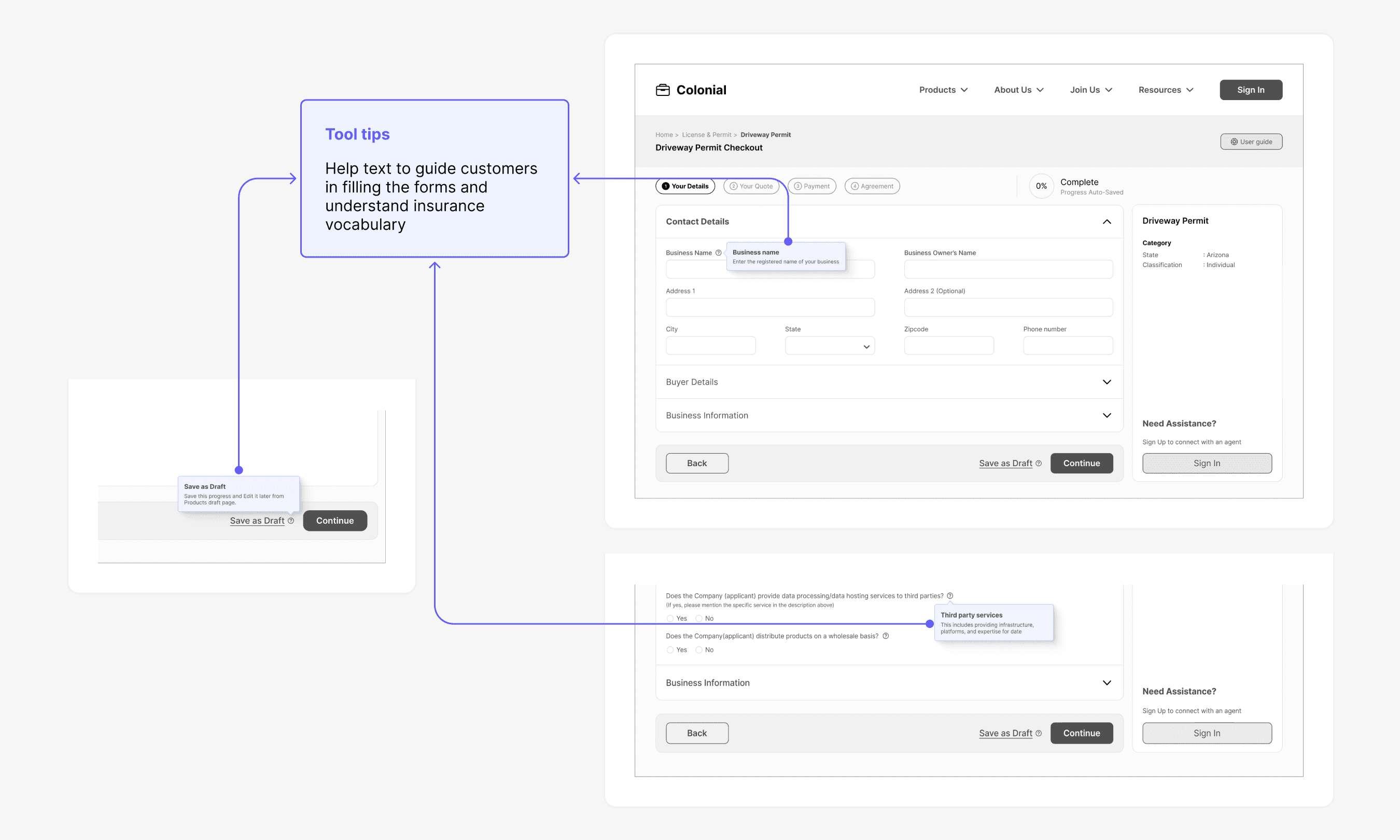
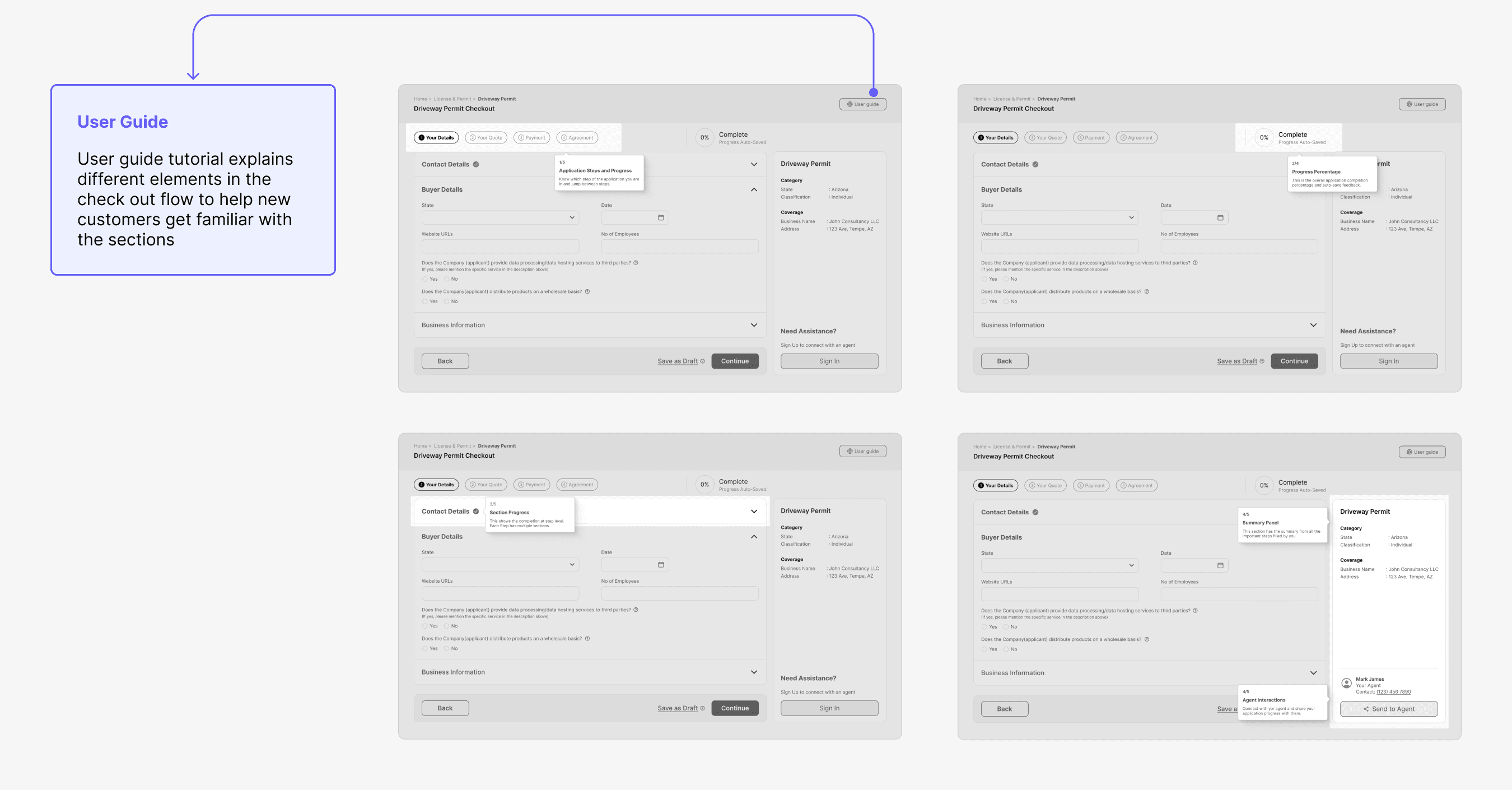
Guide the user at every step of the check out process. Ultimately guide new users and existing users towards their goal through simple non-invasive cues and help.
Guide the user at every step of the check out process. Ultimately guide new users and existing users towards their goal through simple non-invasive cues and help.




Flexibility
The goal here is to cater to a variety of user needs, preferences, and levels of expertise through multiple user paths and allowing self-paced interaction with the checkout flow.
The goal here is to cater to a variety of user needs, preferences, and levels of expertise through multiple user paths and allowing self-paced interaction with the checkout flow.


Transparency
Keep users informed throughout the checkout process with real-time updates on their application status, payment confirmation, and next steps to build trust and clarity
Keep users informed throughout the checkout process with real-time updates on their application status, payment confirmation, and next steps to build trust and clarity


Convenience
Users need not worry about the insurance purchase related tasks. This solution tracks the insurance expiration dates, provides renewal alerts and auto saves applications to drafts to keep the progress.
Users need not worry about the insurance purchase related tasks. This solution tracks the insurance expiration dates, provides renewal alerts and auto saves applications to drafts to keep the progress.


UI concepts
UI concepts
UI concepts
I sketched some ideas and turned them into design mocks and flows. In several rounds, I tested the prototypes, observed users interacting with them, documented to their likes and dislikes to iterate the initial mockups.
I sketched some ideas and turned them into design mocks and flows. In several rounds, I tested the prototypes, observed users interacting with them, documented to their likes and dislikes to iterate the initial mockups.
Web Portal
Web Portal
Portal Landing Page | Product Listing | Product Discovery Quiz | Help Resources | Product Details page
Portal Landing Page | Product Listing | Product Discovery Quiz | Help Resources | Product Details page


Self Check out Flow
Self Check out Flow
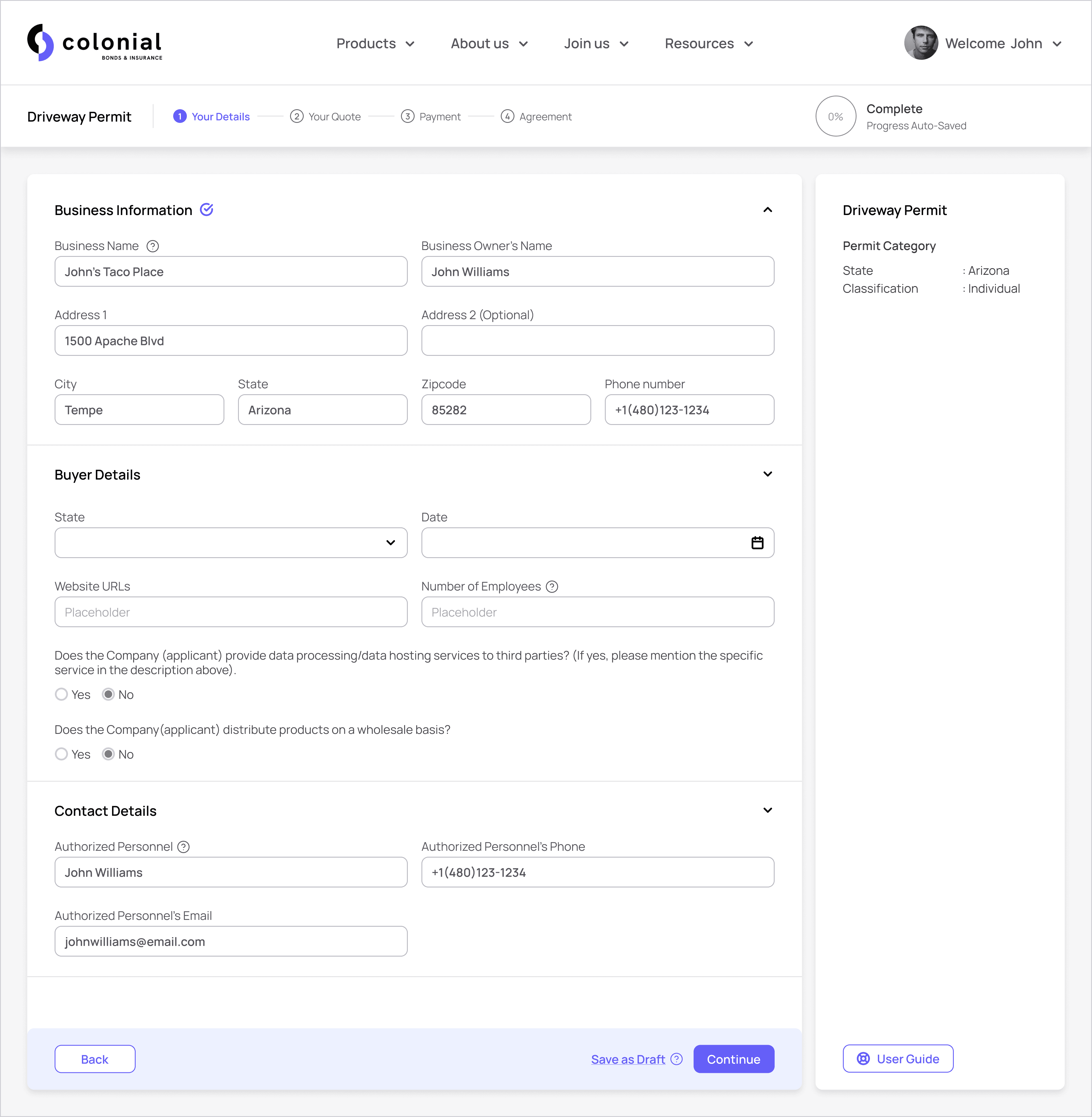
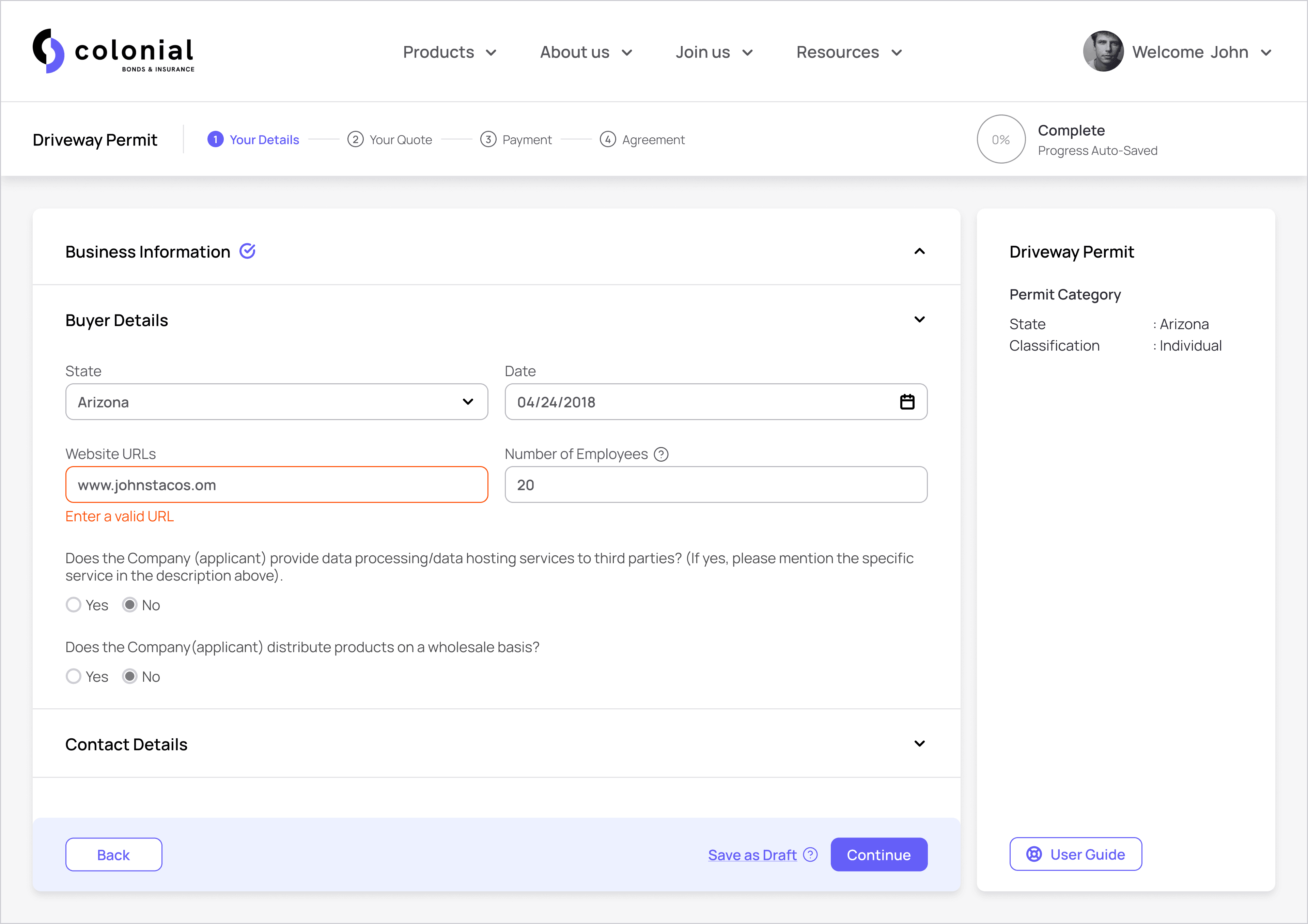
Guest users can get a quote, navigate through the check out flow till payment. Logged in users can save their progress and send their application to their agent.
Guest users can get a quote, navigate through the check out flow till payment. Logged in users can save their progress and send their application to their agent.




Customer Dashboard
Customer Dashboard
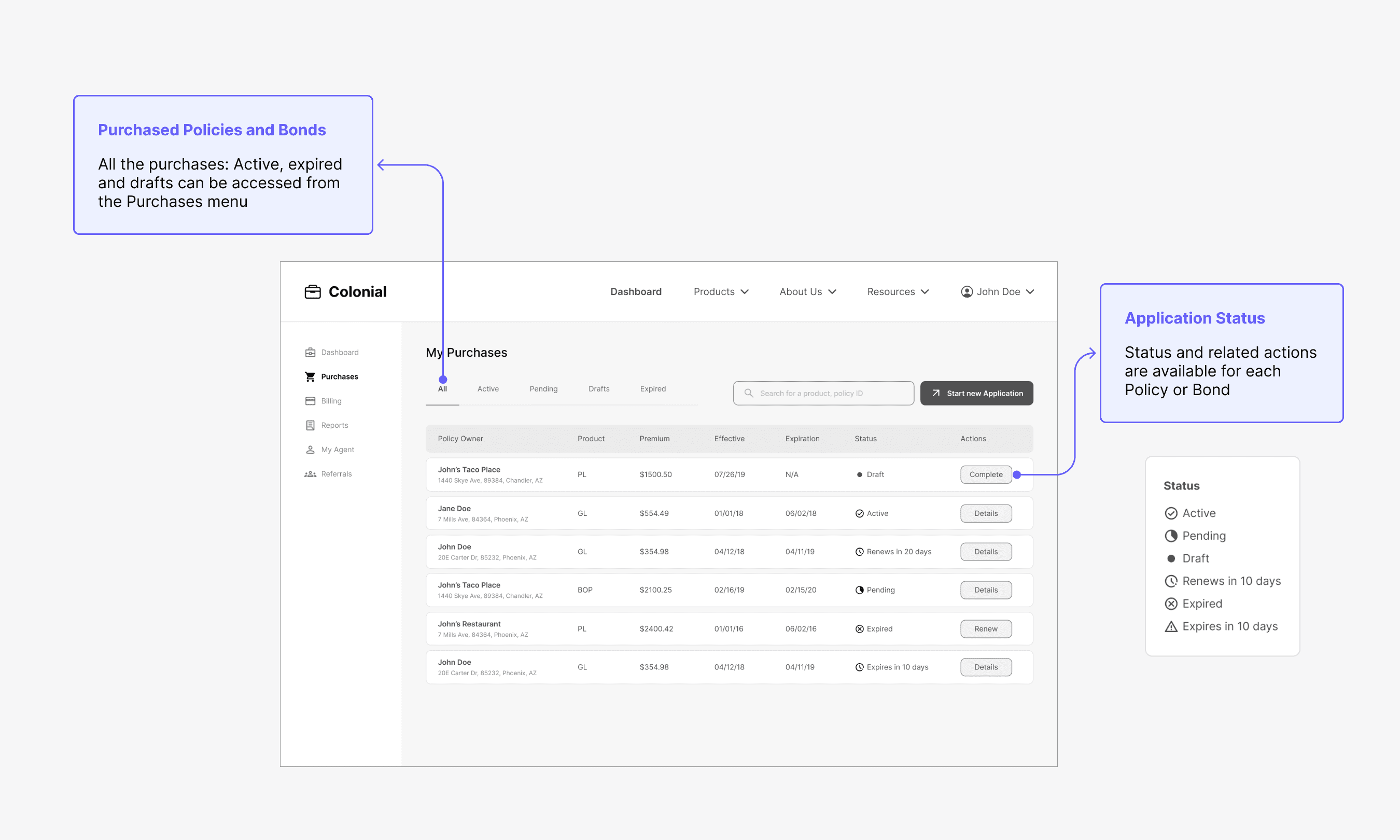
Logged in users can view and track the purchased policies and get suggestions to new products based on their purchases
Logged in users can view and track the purchased policies and get suggestions to new products based on their purchases


Takeaways
Takeaways
Takeaways
When I look back at my process and design approach for this project, here are some of the things I might do differently
Autofill form: Some of the policyholder details, like contact details and addresses, are common across all the policies purchased by a customer. In the case of businesses, some business related information might be common across different policies. Auto populating as much information as possible can make the purchase process efficient. I would look into the security aspect of storing this information within a user account.
Mobile App: Insurance domain has complex terminology and long forms. While a web interface might provide the real-estate to accommodate the content, a mobile app can come in handy to view and share policies, check for expiration dates. This can be useful for agents who track their client portfolios. I would explore the use cases and requirements of the intermediary personas to understand the need for a mobile interface.

